Did you know nearly 70% of homeowners in Cape Town change their interior design every year? This shows a lively market for home décor, where new paint trends can change spaces and improve looks.
In this article, we dive into how social and aesthetic changes in Cape Town inspire us to make lovely, calm homes. By getting the local market’s unique tastes, we can pick colours and options that bring harmony to our homes.

Key Takeaways
- Explore the evolving colour palette of Cape Town’s interiors.
- Understand the emotional connection to paint choices.
- Discover practical and timeless options for home décor.
- Learn how social dynamics influence design trends.
- Incorporate local tastes and preferences into your interior design.
The Colour of the Year 2026: Pennygum
Pennygum is the colour of the year 2026, chosen by Paint Club. It’s a soft grey-silver-green shade. This colour is inspired by South Africa’s healing eucalyptus penny gum bush.
Its calm tones are perfect for our living rooms and bedrooms. Pennygum brings a sense of nostalgia and tranquillity. It reminds us of our connection to nature.
Emotional Resonance of Pennygum
Pennygum is more than just a pretty colour. It has a deep emotional impact. Its subtle nature gives us quiet confidence.
We can use it in many decor styles without feeling overwhelmed. This gentle hue creates a peaceful space. It turns our homes into havens of calm.
Natural Inspirations Behind the Shade
The beauty of the penny gum bush inspires Pennygum. This colour captures the essence of South Africa’s landscapes. It pairs well with warm neutrals like True Ivory.
This combination brings balance to our homes. It makes our living spaces feel harmonious.

Dulux’s Rhythm of Blues Collection
The Dulux Rhythm of Blues collection is a vibrant mix that matches the latest colour trends for 2026. It includes three main shades designed to make our homes feel more emotional and creative. Each colour adds its own vibe, helping us show our style and create spaces that feel right.
The Three Key Shades
- Mellow Flow™: A light, calming blue that brings peace.
- Slow Swing™: A deeper shade that feels peaceful.
- Free Groove™: A bright colour that sparks joy in our homes.
How Each Shade Influences Interior Design
Using colours from the Dulux Rhythm of Blues collection changes our homes in amazing ways. Mellow Flow™ makes calm areas perfect for unwinding. Slow Swing™ adds calmness to bigger spaces. On the other hand, Free Groove™ brings fun and energy, ideal for lively areas.
This mix of colours not only follows current trends but also lets us make our homes our own. It’s all about matching our homes to our personal tastes and lives.

Earthy Tones: A Popular Choice for 2026
Looking ahead to 2026, earthy tones are set to be big. They bring a natural elegance and calm to our homes. Colours like terracotta, ochre, and soft neutrals warm our spaces and connect us to nature.
The Appeal of Earthy Undertones
Earthy tones create peaceful spaces that soothe our senses. They offer a calm escape from our busy lives. Adding these colours to our homes turns them into peaceful retreats.
How to Incorporate Earthy Tones in Your Home
There are many ways to bring earthy tones into our homes. Here are some tips:
- Paint an accent wall in terracotta or soft taupe for warmth.
- Choose furniture made from wood or rattan to show off their natural beauty.
- Use accessories like ceramic vases and textiles in earthy shades to enhance your decor.
Pairing earthy tones with plants or botanicals strengthens our bond with nature. This way, we create spaces that promote comfort and well-being.

Layering Colours for Depth and Texture
Layering colours is key to adding depth and texture to our homes. Mixing neutrals with vibrant hues can change a room, making it lively yet welcoming. Learning to blend these colours well helps us create a balanced look that reflects our style.
Combining Neutrals and Vibrant Hues
Neutrals and vibrant hues work together beautifully when layered. Neutrals provide a calm base, letting bold colours shine. For example, soft greys or whites pair well with bright emerald green or royal blue. This mix creates a lively contrast that energises the space while keeping it calm.
Creating a Textural Contrast
Texture adds interest to our spaces, making them more engaging. We can use different materials like linen, timber, and curved pieces with painted walls. Adding textured finishes brings a touchable quality to our spaces.
Using woven textiles or wooden surfaces balances bright colours and softens the look. This makes our spaces both stylish and comfortable.

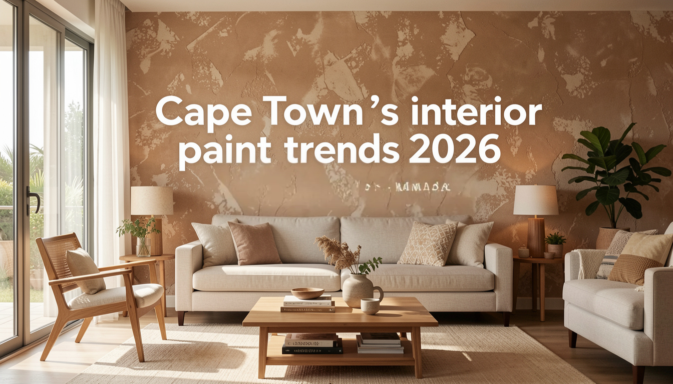
Warm Neutrals: Soothing and Timeless
Warm neutrals are popular in home decor for their soothing feel and timeless look. Shades like creamy beiges, soft greys, and taupes make our homes feel welcoming. We’ll look at how these colours can make any space feel cozy and inviting.
Best Uses for Warm Neutral Tones
Using warm neutrals in our decor brings a calming and unified look. They work well in:
- Large living areas, making them feel open.
- Cozy bedrooms, perfect for a peaceful escape.
- Contemporary kitchens, adding a touch of elegance.
Pairing Warm Neutrals with Other Shades
Warm neutrals are great for mixing with other colours. They look good with:
- Bright colours, adding energy to a room.
- Darker shades, like deep greens or browns, for balance.
This mix creates a smooth flow in our homes. It shows how warm neutrals add elegance to both decor and design.

Accent Walls: A Bold Statement
Accent walls are a striking feature in our spaces. They let us add creativity and make bold statements in interior design. Choosing the right colour for these walls is key. We need to think about the room’s purpose and the colours already there.
We’ll look at colour selection and design techniques. This ensures the accent wall fits well with the rest of the decor.
Choosing the Right Colour for Accent Walls
When picking colours for accent walls, think about how they make us feel. Darker shades can make a room feel warm and cozy. Lighter tones can make it feel brighter and more open.
It’s important to pick a colour that stands out but also goes well with the other walls. This way, it becomes a real focal point.
Accent Wall Design Tips
There are many ways to create accent walls. We can use paint, wallpaper, or textured finishes. Here are some tips:
- Textures: Using textured wallpaper or paint adds depth and interest.
- Complementary Decor: Matching furniture and artwork with the accent wall’s colour makes it more impactful.
- Strategic Placement: Putting the accent wall where it catches natural light draws attention and improves the room’s look.
Natural Textures and Materials
Using natural textures in our homes makes them more comfortable and beautiful. The right mix of textiles and paint creates welcoming and stylish spaces. Fabrics like wool, cotton, and jute add warmth and depth.
The Role of Textiles in Modern Interiors
Adding textiles to our decor brings layers of interest and harmony. We can choose fabrics for their comfort and to match our colour schemes. Layering different textiles in your space adds a rich tapestry that goes well with your paint colours.
Combining Paint with Natural Materials
Mixing paint with stone and wood can make a room stand out. Choose colours that match the natural hues of these materials. A balanced design happens when paint finishes match the natural textures of your decor. This balance makes our spaces richer and more meaningful.
Playful and Joyful Hues
In our quest for lively and welcoming homes, playful colours are key, more so in family areas. The way colours affect our mood and how we interact is significant. By picking colours that bring joy and spark creativity, we make spaces where families can grow and make memories.
The Importance of Colour Psychology
Colour psychology shows how colours and emotions are linked. Bright colours like yellow and green can make a room feel lively and open. Knowing this helps us choose colours that show our family’s spirit and dreams.
Integrating Playful Colours in Family Spaces
We can add playful hues to different parts of our homes, like kids’ rooms or living areas. Here are some tips:
- Highlight cheerful accents: Use joyful colours in artwork, cushions, or fun furniture to draw attention.
- Mix and match: Combine bright colours with calmer ones to keep things balanced and let colours pop.
- Focus on functionality: Pick colours that are not just fun but also practical and simple to keep clean.
By thoughtfully adding these lively colours, we create spaces that boost interaction and fun. This makes our family areas both lovely and useful.
Top Interior Paint Trends for 2026
This year, interior design is set for exciting changes. We’re focusing on colours that match our modern lifestyle. Personalised spaces are becoming more popular, with a focus on mindfulness and sustainability.
Overview of Key Trends in Coordination
In 2026, colour coordination is key. People want colours that bring harmony and balance to their homes. We’re seeing more texture and shade combinations, adding depth to our spaces. This year’s trends include:
- Earthy tones with vibrant accents for depth.
- Soft pastels with natural materials for an environmental feel.
- Bold hues that spark conversation while keeping designs cohesive.
How Trends Reflect Lifestyle Changes
The trends of 2026 show a shift towards comfort, sustainability, and nature. We want our homes to be beautiful and good for our well-being. Our paint choices reflect a need for calm and refreshing spaces.
This inspires us to design our interiors with care. We choose colours that improve our daily lives.
Eco-Friendly Paint Options
More of us are choosing eco-friendly paint for our homes. This shows we care about the planet. By picking sustainable paint, we make our homes better and help the environment.
The Rise of Sustainable Paint Choices
Sustainable paint is becoming popular. It’s good for us and the planet. Low-VOC paints and natural ingredients mean cleaner air inside. More brands are now making eco-friendly paints that look and work great.
Benefits of Eco-Friendly Paints
There are many good reasons to use eco-friendly paint:
- Health advantages: These paints cut down on harmful chemicals, making our homes healthier.
- Environmental impact: They help reduce our harm to the environment and support nature.
- Durability: Eco-friendly paints often last longer, saving us from frequent repainting and waste.
Utilising Lighting to Enhance Colour
Lighting greatly affects how we see colour in our homes. Knowing how natural and artificial light changes our colour choices helps us create the perfect mood. By choosing lighting wisely, we can make our colours pop, making our spaces feel welcoming and unified.
The Impact of Natural and Artificial Light
Natural light changes throughout the day, bringing different colours to our walls. Morning light is soft and warm, perfect for warm colours. But midday sun makes cool colours stand out. Artificial lights, like LEDs, also change how we see colours, adding their own unique feel to a room.
We need to think about both natural and artificial light to get the best look. This balance is key to a harmonious space.
Best Practices for Using Lighting with Paint
To get the most from our lighting and colours, follow these tips:
- Choose the right bulbs: Warm bulbs add depth, while cool bulbs give a modern feel.
- Use multiple light sources: Mixing different lights adds depth and reduces shadows, making colours pop.
- Position lights strategically: Directing lights can change how we see colours on walls.
- Consider fixtures design: The style of your lights should match your room’s colours. Elegant fixtures highlight your design’s best features.
Conclusion
As we wrap up our look at the top interior paint trends for 2026, it’s clear that home decor in Cape Town is changing. It now focuses on emotional connections and natural beauty. Trends like Pennygum’s warm tones and earthy hues mix modern styles with classic ones.
Our choices in interior design show how our lives are changing. By knowing these trends, we can make homes that are both useful and emotionally uplifting. Our homes should show who we are, through the colours we choose.
These 2026 trends help us create spaces that bring us together and make us feel at ease. As home decor evolves, let’s use these ideas to make homes that truly reflect our values and what we love.
FAQ
Q: What are the leading plascon and dulux 2026 colour trends for Cape town’s top interior paint trends for 2026?
A: Both Plascon and Dulux have highlighted earth tones, botanical greens, and deeper charcoals in their 2026 colour forecasts. Expect curated palettes that mix matte sage and terracotta accents with warmer neutrals — a refined approach that resonates with south african interiors and the global 2026 colour trends movement.
Q: How does the 2025 forecast influence the 2026 palette and colour ideas for cape homes?
A: The 2025 forecast laid the groundwork with soothing neutrals and nature-inspired hues; 2026 builds on that by energising rooms with richer terracotta, aromatic botanical greens and charcoal anchors. This transition helps homeowners refresh or refocus schemes without dramatic overhauls, allowing effortless updates like a new tint on cabinetry or a feature wall.
Q: Which earth tones and charcoal accents are best to create a home that feels both modern and timeless?
A: Choose warm earth tones such as terracotta, muted ochre and clay paired with deep charcoal for contrast. Use charcoal for trim, cabinetry or a focal wall to ground botanical or sage palettes. A matte finish can add a contemporary, decorative feel while keeping the overall look relaxed and easy to live with.
Q: Can I use these 2026 colour ideas on cabinetry and tiles, and how do I coordinate finishes?
A: Yes — apply new colour tints to cabinetry for a big impact and select coordinating tile tones for backsplashes or floors. Pair matte painted cabinetry in sage or charcoal with glazed tiles in complementary earth tones to create texture and visual interest. Brass hardware and subtle aromatic accents (plants, scented textiles) can refine the scheme.
Q: What are simple ways to energise or refresh a room in Cape Town without a full repaint?
A: Focus on swapping accessories, repainting a single wall in a 2026 new colour, refinishing cabinet fronts, or introducing botanical textiles and plants. Small touches like brass accents, decorative cushions in terracotta or sage, and repositioning artwork from Pinterest-style moodboards can refresh a space effortlessly.
Q: How can I take inspiration from the dulux colour forecast and adapt it to South African interiors and climate?
A: Use the Dulux 2026 palette as a starting point, then adjust saturation and undertone to suit local light and materials. In Cape Town’s bright, coastal light, warmer earth tones and muted sage often read truer; charcoal works well for internal features while reflecting outdoor landscapes to create a cohesive inside-outside feel.
Q: What does “outside the box” colour usage look like for Cape homes in 2026?
A: Outside the box means combining botanical greens with terracotta or charcoal in unexpected places — think painted ceilings, stair risers, or interior doors. Pair aromatic textiles and tactile finishes with bold cabinetry colours to create an engaging, decorative environment that still feels effortless and lived-in.
Q: Are matte finishes recommended for the 2026 trends, and how do they affect maintenance and longevity?
A: Matte finishes are very on-trend for 2026, offering a sophisticated, refined look that complements earth tones and botanical palettes. While matte can show marks more easily than satin in high-traffic areas, modern formulations (including Plascon and Dulux options) are more durable and washable — making them suitable for most south african interiors when properly specified.
Q: Where can I find colour inspiration and practical tips for implementing these 2026 trends in my Cape Town home?
A: Look to manufacturers’ 2026 colour forecasts, Pinterest moodboards, local showrooms, and interior blogs focusing on south african interiors. Sample paints on different walls and times of day, create a palette that includes a charcoal anchor, botanical sage, terracotta accents and neutral tints, and consult professionals for cabinetry, tile selection and final refinements to ensure the scheme will resonate in your home.


